I have now finished all of my A2 coursework, and declare this A2 media blog finished!!
Good luck to everyone for their coursework and exams, and remember, keep calm and GANGNAM STYLE!!!
Friday, 22 March 2013
Evaluation Question 4
For my fourth evaluation question, I have created a video with me narrating over it.
If the audio seems quiet for any reason, please make sure to turn up your volume so that you can clearly hear my answer to the evaluation question:
If the audio seems quiet for any reason, please make sure to turn up your volume so that you can clearly hear my answer to the evaluation question:
Evaluation Question 3
What have you learned from your audience feedback?
I have learned a great deal from my audience feedback, and my audience in many cases has been the deciding factor in my choice of fonts, images, etc.
Throughout the creation of my media products, I always considered my audience when making decisions, since all my products are aimed at my audience, and what appeals to them is most likely to grab their attention.
The Music Video
Whilst making my music video, I asked my audience religiously if there were improvements that could be made, once I had completed the Rough Cut.


I asked for feedback in nearly every post, as well as in the forms of questionnaires, polls, and even just asking my media classmates for their opinion on my work.
I did this so that I could achieve products that appealed most to my target audience and thus create the most successful product possible.
What I learnt from feedback was that people liked my animation, but it needed to be extended where it was still and had no movement, since it dragged on. I also learnt that the lighting in certain shots wasn't to its fullest potential.

Comments such as the ones above caused me to make improvements to my music video through further animation and experimentation with effects. Therefore I am glad my work was criticised as it allowed me to learn where my video felt flawed and thus create a more professional and appealing (to my audience) media product.
The Digipak
The audience played a major role in deciding on the content of my Digipak, as they made decisions such as the name of the album, font style and the images that were going to be used.


They audience also let me know, through a questionnaire, whether any changes should be made to my Digipak in order to improve it in any way.

So from my audience feedback, I learnt what the most popular/appealing content would be, as well as if the audience though any content should be added/removed/changed. Learning all this information ultimately allowed me to create a better and more appealing product, since the audience is who I'm trying to appeal the product to, and applying what they most liked meant the most appealing product possible.
The Magazine Advert
I learnt much from the audience about my advert through the use of questionnaire, much like my digipak.

Learning how my audience felt about my advert (whether anything should be added/removed/changed) allowed me to learn whether my product was appealing to my audience (which was of course my aim, along with making it look professional). Knowing it was appealing through my questionnaire allowed me to have ease of mind, as otherwise I may have added/removed/changed the content unnecessarily, thus ruining my advert, but thanks to my audience I learnt that the advert was perfect the way it was, allowing me to create a product with maximum audience appeal.
Evaluation Question 2
To answer evaluation question 2, I have created a Prezi.
Don't forget to click the images and text to zoom in where necessary, and I hope you enjoy my Prezi (also please ignore the fact the Prezi says it's by James Doom, as this is the name I gave to my Prezi account due to the fact the word Doom is in the email address attached to the account, but to make sure you, the examiner, knows its is definitely my Prezi and not stolen, I included my real name at the top left when the Prezi begins).
Don't forget to click the images and text to zoom in where necessary, and I hope you enjoy my Prezi (also please ignore the fact the Prezi says it's by James Doom, as this is the name I gave to my Prezi account due to the fact the word Doom is in the email address attached to the account, but to make sure you, the examiner, knows its is definitely my Prezi and not stolen, I included my real name at the top left when the Prezi begins).
Evaluation Question 1
Evaluation Question 1 is answered on the website I have created.
Please use the navigation at the top of each page to explore my answer to the question, and be sure to fully explore each page by scrolling down each time so that you can see my entire answer.
The website address is: http://www.i-m.co/doomwow/EvalQuestion1/
Please use the navigation at the top of each page to explore my answer to the question, and be sure to fully explore each page by scrolling down each time so that you can see my entire answer.
The website address is: http://www.i-m.co/doomwow/EvalQuestion1/
Thursday, 21 March 2013
Approaching My Evaluation Questions
In order to show that technology has been integrated into my everyday life/work and how much I know about different technologies, I will be tackling my four evaluation question in a variety of ways:
I hope you all look forward to my evaluation questions.
Until next time.
- The first question will be answered in the form of a website.
- The second question will be answered in the form of a Prezi.
- The third question will be answered in the form of a blog post.
- And the fourth question will be answered int he form of a video with narration.
I hope you all look forward to my evaluation questions.
Until next time.
Production - Magazine Advert Complete!!!
I now declare my Magazine Advert complete!
Below is my finished magazine advert:

As you can see from my magazine advert, my focus was on the maximum amount of synergy possible, as well as a great amount of promotion. Synergy was achieved through the use of colour scheme, font and the drawings, as they are all used on the other media texts (music video/digipak) thus achieving synergy and giving these products related to Newton Faulkner (the artist) a style that can be easily recognised. I also aimed to maximise promotion, through making sure that the audience knew what the album look like, allowing it to be easily identified online/in-store. Through giving the audience the websites associated with the artist, allowing them to learn more about him and his other music. Through giving the audience the name of the record label that is associated with the artists, allowing the record label to be promoted as well as other artists that are part of the label. And finally through using reviews to promote the album as a high quality product, and through making sure the audience knew the album was available both in-store and online, and that all editions include the music video for "Dream Catch Me", thus increasing the chance of sales since the audience knows they will be getting not only a quality product but one with an added extra too.
This post was mainly just to declare my advert finished, which I have now done, as well as give some insight into my aims whilst producing this magazine advert, which were to create a professional looking advert that maximises synergy and promotion of the artist, which I can gladly say I believe I have achieved.
I am proud of the finished product and am very proud to declare it finished.
That raps it up for this post everyone but be sure to follow my blog for my evaluation questions coming soon.
Until next time everyone.
Draft Magazine Advert Questionnaire Results
I gave the questionnaire to 9 people, along with showing them my music video and digipak, and below are the general results (since each response was unique as the answers wern't set answers, but spaces for people to give their own answers, hence why 'm giving the generals results instead of each result, which would make this post drag on for much too long):
In response to "Do you think there is anything that could be added to the Magazine Advert in order to make it look better?, and if so, what is it and why?", the response, in more or less words, was NO.
I was surprised that there was nothing that the 9 people questioned wanted to add, perhaps because I tried to fill the space without making it seem cluttered and thus people thought the space was covered well (this was in fact involved in 2 of the answers received; that the space was used well). I am glad I received this response as I believe the space was filled with all the necessary information, plus extras that added synergy and added quality to the look of the advert.
In response to "Do you think anything should be removed from the Magazine Advert that looks out of place/unsuitable?, and if so, what is it and why?", the response was, in more or less words, NO.
I was very surprised by this, as even though I tried to fill the space available without making it seem cluttered, I was worried some people still would find it cluttered, but surprisingly people didn't. In terms of why people thought nothing needed to be removed, they all mentioned they thought the layout was nice just the way it was, and some mentioned removing anything would leave space where the advert would seem empty/boring. I'm very glad this was the response I received as my biggest fear was that people would think the advert was cluttered, but to hear that they think the layout is good the way that it is really pleases me.
Finally, in response to "Would you do anything different to how I have presented the Magazine Advert?, and if you would, what is it and why?", the response was varied. Here I received 5 responses that said they wouldn't change how the advert was presented because they were happy with the layout, and 4 responses that said they would change the layout but the only reason was due to personal preference. Because of this, I am going to keep my layout the way it is, since the response to the first two questions was incredibly good, and changing the layout now may cause people to want to change things in the advert, as a change of layout can have that effect, since what is included currently may not work when laid out differently.
So, because of this response to my magazine advert questionnaire, I will not be changing anything else. This of course means I can declare my magazine advert complete, which I am incredibly happy about. So, in my next post this is what I will declare, that no more changes will be made and that my magazine advert is finished, and then after that the only posts that will appear on my blog are my evaluation questions and a final post saying that my coursework is complete.
So guys and girls, that raps it up for this post, but be sure to watch for my declaration that I have finished my magazine advert, and then after that, my evaluation questions and farewell post.
Until next time everyone!
Wednesday, 20 March 2013
Draft Magazine Advert Questionnaire
Now that I have completed all of my designs for my Magazine Advert, the only thing left to do is ask people whether they think anything should be added/removed/etc. , just as I did with my Digipak. If there is nothing to change then I will declare the magazine advert complete.
I have created a questionnaire in Microsoft Word that I will give to people, along with showing them my music video via computer/phone with 3G, and showing them my printed out Digipak, so that they understand the synergy between the different media texts.
This, like my Digipak questionnaire, will be short and sweet. The questions are as follows:
-----
Do you think there is anything that could be added to the Magazine Advert in order to make it look better?, and if so, what is it and why?
_________________________________________________
Do you think anything should be removed from the Magazine Advert that looks out of place/unsuitable?, and if so, what is it and why?
_________________________________________________
Would you do anything different to how I have presented the Magazine Advert?, and if you would, what is it and why?
________________________________________________
-----
I will conduct the questionnaire and then post the results soon.
So be sure to watch my blog very closely for the results of my questionnaire, and possibly any changes to my magazine advert as a result.
Until next time everyone :)
Production - Magazine Advert Second Draft Complete!!!
I have now completed the second draft of my magazine advert as you can see below, followed by an explanation of the changes made and how I made them:

.jpg)
As you can see, the changes I have made are the smaller hearts surrounding the larger heart, like the drawing in my music video (thus achieving further synergy).
I added these smaller hearts by first selecting the large heart using the Rectangular Marquee tool. I then used the Edit menu to copy and paste the heart. Next I made the heart smaller using the Cursor tool and then used the Edit menu again to copy and paste five more smaller hearts. Finally I rotated/positioned all six smaller hearts around the larger heart by using the Cursor tool.
Like the larger heart and characters, I believe these are good because they achieve synergy, are visually appealing, fill the space and finally, don't feel like they're cluttering the open space. I am going to keep these and I now can declare my magazine advert second draft complete.
I will soon conduct a questionnaire about my second draft and make changes accordingly.
That raps it up for this post everyone, but be sure to follow my blog for more posts coming soon, scuh as my evaluation questions.
See you all next time.
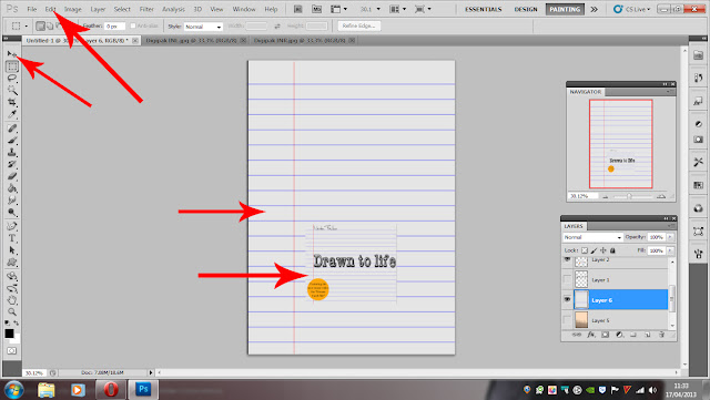
Production - Magazine Advert Second Draft Progress 4
Below is the fourth stage of my magazine advert second draft, followed by an explanation of the changes and how I added them:

I have now added the heart from the Inner Middle Pane of my digipak/music video.
I did this by selecting it from the Inner Middle Pane using the Rectangular Marquee tool and then using the edit menu to copy and past it onto my magazine advert. Finally I scaled/positioned it using the Cursor tool.
I like the heart because it not only adds synergy but is is a pleasant/cute space filler, much like the characters below the album title.
I have one more thing to add, which will be shown in the next progress post and then my second draft will be complete. I will then ask my audience questions to do with my magazine advert and if there is anything that the majority think should be changed, I will change it. If not, then I will be able to declare my magazine advert complete.
That raps it up for this post, but be sure to pay attention for the next post coming really soon!
Until next time.
Production - Magazine Advert Second Draft Progress 3
Below you will see the third stage of the magazine advert second draft, followed by an explanation of the changes I've made and how:

As you can see I have now added the artist's name above the name of the album.
This was done by using the Rectangular Marquee tool to select the name from the front cover of the digipak, and then pasted into position using paste from the Edit menu.
The name is vital as otherwise it's not completely obvious who's album this is, when it needs to be. So now that I have added this detail that I previously didn't add, I am definitely keeping this addition to my magazin advert.
That raps it up for this post everyone but be sure to follow my blog for more updates coming soon.
Until next time.
Production - Magazine Advert Second Draft Progress 2
Below is the second stage of my magazine advert second draft, followed by an explanation of the changes made and how I made them:

The changes made are that I have now drawn the two characters from my music video/digipak onto the advert.
I did this by using my graphics tablet and the Brush tool on the sidebar. Once this was selected I first drew my characters much bigger than they currently are, and then used the Cursor tool to scale and place the characters appropriately.
I like the change as it adds more synergy to my products and the characters are a cute space-filler without cluttering the space. So my verdict is that I am definitely keeping the characters where they are as I really like the addition.
That raps it up for this post everyone but be sure to follow my blog for more updates coming soon.
Until next time :)
Production - Magazine Advert Second Draft Progress 1
Below is the first stage of my second draft, along with an explanation of the changes I have made/how I made them:

1. I added the record label name through the use of the Horizontal Type tool, by drawing a text box and then simply typing the name of the artist's record label.
2. I added the record label's logo by first copying it off of google images. I then pasted it using the Edit menu and removing the background using the Magic Wand tool and the delete key on my keyboard. Finally I scaled and positioned the logo using the Cursor tool to where I thought it looked appropriate.
I will definitely keep these changes on the advert as I feel these, along with what is already present, is necessary information.
That raps it up for now everyone, but be sure to follow my blog for more updates coming soon.
Until next time.
Production - Magazine Advert First Draft Complete!!!
Below you will see the completed first draft of my magazine advert, followed by an annotated version where I will explain the changes I have made and how I made them:

.jpg)
The changes made since the last post are the reviews on the left and right side of the digipak. The reviews for the album were added by drawing a text box on the left and right side of the digipak and then typing in flattering reviews via my keyboard.
This is the first complete draft of my magazine advert. I am now going to add the other things that were on my draft drawing (which can be seen below) and see whether they look good or not, as I feel that my magazine advert now contains everything necessary and adding more may may it look worse (but then again it may also make it look better).

Until next time everyone.
Production - Magazine Advert Draft Progress 4
Below is the fourth stage of my magazine advert production, along with an explanation of how I created it:

The changes made since the last post is that I have now added information about the album.
I did this through creating a text box through the Horizontal Type tool and then typing the information that I felt was appropriate for the advert (i.e. that the album is out both digitally and in stores, and also that in either edition, it will come with a music video for "Dream Catch Me").
That raps it up for this post everyone, but be sure to follow my blog as always for more updates coming soon.
Until next time.
Production - Magazine Advert Draft Progress 3
Below is the third stage of the creation of my magazine advert, along with the details of how I created it:

As you can see I have now added the digipak title as well as the two website addresses for the artist.
The title was added by using the Rectangular Marquee tool to select the title from the Front Pane of my digipak. I then used the Edit menu to copy it and paste it onto this advert. One this was done I used the Cursor tool to scale and position the tile appropriately. The website addresses were added by using the Horizontal Type tool and then scaled/positioned appropriately using the Cursor tool. The font used for the website addresses was Century. I did play around with multiple fonts, including Times New Roman, Bell MT and Calibri, but I decided that Century was the perfect mix of formal (and legible) and informal (as in more relaxed).
That raps it up for this post everyone, but don't worry as there will be plenty more really soon.
Until next time :)
Production - Magazine Advert Draft Progress 2
Below is the second stage of my magazine advert along with how I created it:

As you can see, this clearly works much better than my previous background, and it also uses colours from the inside of my digipak, so it retains synergy.
To create this background I used the Rectangular Marquee tool to select a section of the background I thought would work well from the Inner Right Pane. I then used the Edit menu to copy it and past it onto this magazine advert. Finally I scaled and positioned it on the dimension through the use of the Cursor tool.
That raps it up for now guys and girls, but be sure to pay attention for more posts coming soon :)
Until next time.
Production - Magazine Advert Draft Progress 1
Below you will see the first step of my magazine draft, along with how I created it:
As you can see I have used the edit menu to paste on the lined A4 paper background onto these dimensions, and then used the Cursor tool to position it correctly. Afterward I did the exact same with the front cover of my digipak.
From looking at this I have to say that I don't think the digipak stands out well due to the use of same background for the magazine advert. I will definitely try something else and will put up a post very soon showing the difference.
That raps it up for now, be sure to follow my blog for more updates and I'll see you all next time :)
Magazine Advert Draft
Something I noticed with my digipak was that my draft, wasn't so much a draft as a finished product, and the flat plan was more like the beginning stages of the draft. My point being that here, as you will see below, the draft for my magazine advert I am staring out as a simple drawing.
I plan to make the dimensions the same as an A4 piece of paper as many magazines print in this size, also the magazine advert can be easily resized to fit any magazine but A4 is just the dimension I want to work to.
Below you will the very first draft of my magazine advert:

I plan to make the dimensions the same as an A4 piece of paper as many magazines print in this size, also the magazine advert can be easily resized to fit any magazine but A4 is just the dimension I want to work to.
Below you will the very first draft of my magazine advert:

From this you can see some of my solid ideas, as well as some ideas that I will play around with while I am producing the magazine advert.
From this you can see that the element I am most striving to achieve is synergy across all 3 media texts (music video, digipak and magazine advert) through the use of the same elements such as colour scheme, animated characters, etc. I am also striving to achieve a great deal of promotion for the artist through the reviews as well as the record label he is associated with.
Anyway guys and gals, that raps it up for this post.
Be sure to pay close attention to my blog for all the production for my advert coming really soon :)
Until next time everyone.
Production - Digipak Complete!!!
That's right everyone!, following from what I said in my previous post; my digipak is now complete!!!
below you will see the finished product, first with each pane separately, then connected together appropriately and finally:
FRONT PANE (COVER)


below you will see the finished product, first with each pane separately, then connected together appropriately and finally:
FRONT PANE (COVER)

BACK PANE (COVER)

ADDITIONAL PANE

SPINE
INNER LEFT PANE

INNER PANE MIDDLE

INNER PANE RIGHT

And now, connected together appropriately:
INNER PANES

OUTER PANES (AND ADDITIONAL PANE)

And finally, the finished product printed out:


I am very happy with how my digipak turned out and am glad it is now complete because now I will begin my magazine advert.
Anyway everyone, that raps it up for this post.
Be sure to follow my blog for the magazine advert posts and evaluation questions coming soon :)
Until next time everyone.
Draft Digipak Questionnaire Results
The results of the questionnaire are now in.
In total I gave the questionnaire to 10 people and since the answers they gave were each unique, it is easier to give the general answer that I got from analysing the results:
In response to "Do you think there is anything that could be added to the Digipak in order to make it look better?, and if so, what is it and why?", every response surprisingly said in more or less words; NO. This is good because I'm glad that people think that my digipak (after having seen my music video) is at its full potential for the music video/album it is trying to market. So I am incredibly glad this was the response, although as I say, if someone were to have said I should have added something I would have also been glad, as it would have allowed me to seriously consider adding something that would have potentially made my Digipak better, but since the response that people wouldn't add anything, I won't, as it may possibly jeopardise my Digipak.
In response to "Do you think anything should be removed from the Digipak that looks out of place/unsuitable?, and if so, what is it and why?" , again, every respone in more or less words said; NO. When I saw this I had the same feelings as the answers to the previous question, which is that I was glad but at the same time wouldn't have mind if someone did want something removed for a suitable reason, allowing me to create a better digipak. But seemingly, people are happy with my digipak, and so I will leave it just the way it is to be on the safe side.
Finally, in response to "Would you do anything different to how I have presented the Digipak?, and if you would, what is it and why?, I actually did receive some comments about changes people would make. I received a couple of comments about using brighter colours such as reds and oranges (and the reason being that they thought it may work well) as well as one comment about the message being different on the additional pane (that it would be more about the artist to give more detail to him, to inform fans). I did consider the two comments about brighter colours, but after going over my digipak again I decided that I was very happy with the colour scheme the way it was, and that a change in colours may not work well with the theme of drawings/indie music. I also considered the comment about providing more info on the artist, but again I did not alter my digipak. The reason for this is that indie artists are not often very self-centered, especially in the case of Newton Faulkner. So I thought it would be more appropriate to keep the info I had provided, about the effects of piracy on the working man, which is something I strongly believe indie artists may provide information on. To enlighten those and help them stop something that has serious effects on hundreds of people every year, thus helping to combat a real issue in the music industry, and showing compassion for others.
And so, with this questionnaire I have decided that I will now make no further changes to my Digipak, and the next post I will make will declare my digipak finished.
So everyone, that raps it up for this post, but be sure to watch out for my final digipak post and then soon after, my posts about my magazine advertisement.
Until next time :)
Tuesday, 19 March 2013
Draft Digipak Questionnaire
I have now completed the first (and actually possibly final) version of my digipak!
The reason I say that it may be the possible final version is because I have actually completed all that I intended to from my flat plan plus more! So at this point I am struggling to add any more, since the style I was going for (simplistic) has been achieved and even improved (as originally I hadn't planned to add details such as the heart drawing on the inner middle pane, or the filter effects on the artist/actress).
But just to see if there is any other possible details I could add, I have devised a questionnaire on Microsoft Word that I will print out along with a paper version of my digipak, which I will give to people to answer whilst looking at my digipak. Also please note that those who I give the questionnaire to I will also show the music video via a computer or my phone using 3G, so that they can understand the synergy between the digipak and the music video.
My questionnaire asks the following 3 questions:
-----
Do you think there is anything that could be added to the Digipak in order to make it look better?, and if so, what is it and why?
_________________________________________________
Do you think anything should be removed from the Digipak that looks out of place/unsuitable?, and if so, what is it and why?
_________________________________________________
Would you do anything different to how I have presented the Digipak?, and if you would, what is it and why?
_________________________________________________
-----
Really this was actually only a mini-questionnaire to establish whether I should add anything, whether I should remove anything, and finally a question just seeing how others may present the Digipak I was aiming to achieve (thus possibly giving me inspiration for any changes).
I will be sure to post the results soon so be sure to pay close attention to my blog, and that raps eveything up for this post!
Until next time everyone :)
Production - Digipak Middle Inner Pane Draft
below you will see the draft for the middle inner pane of my digipak, followed by an explanation of how I created it:

1. I had originally used a white background here, and I was going to leave this pane blank, as it will be where the disc tray sits, but after my choice to use filters on my inner left and right panes, I decided to change this background to retain the synergy and make the digipak look more professional. I did this by first using the Rectangular Marquee tool to select a section of the filtered photo used on the inner left pane that was darker, as you will see in the inner left pane as it comes towards the right it eventually completely turn the colour used for the background here, thus giving an effect of the filter applying across the entire inner panes (as though they are one long image). After selecting a section suitable, I used the Edit menu to copy and then paste it onto this pane. Finally I scaled the section to fill the pane using the Cursor tool, thus completing the background.
2. I deviated from my original flat plan by adding in this drawing of a heart (one that is in the same style as the one that is seen in the music video, thus retaining synergy between the music video and digipak, making it appear more professional). I added this drawing through the use of my graphics tablet. I simply selected the Brush tool from the sidebar, and then drew the heart straight onto the pane. It did take quite a few tries to achieve the heart that you see now, as I wanted it to look neat but at the same time be entirely drawn on and not manipulated.
That raps up this post guys and girls.
Be sure to watch my blog for the remaining updates to do with my digipak and then of course my posts involving magazine advertisement and evaluation questions.
Until next time :)
Production - Digipak Additional Pane Draft
Below you will see the draft for my additional pane, followed by an explanation of how I created it:

1. I applied all the text by first typing it all into the website Dafont, and then taking screenshots each time, followed by useing the Rectangular Marquee tool to remove it from the screenshots. After this I used the Magic Wand tool to remove the white background and then simply scaled and positioned the text where appropriate using the Cursor tool.
2. The characters were added through the use of my graphics tablet. I selected the Brush tool from the sidebar and then drew them straight onto the pane where I wanted them to be placed.
3. I used Google to find the UK Copyright Service logo, then once I had copied it, I used the Edit menu to paste it onto the pane. I used the rectangular marquee tool to separate it from a larger image containing elements I didn't need, then simply removed the background using the Magic Want tool and the delete key. Once this was done I finished by using the Cursor tool to scale and position it at the bottom left of the pane where I thought it was most appropriate.
4. Finally the background. Originally I had planned to make this white, and I had actually completed the three other stages before I finally decided to change this, as after I completed the three other stages I began using the filters for my inner left and right panes. after I found one that worked and decided to keep it, I changed this background to retain synergy through the cream colour (seen in the background of the inner left and right panes), thus making it look professional. I did this through using the Rectangular Marquee tool on one of the filtered images from the other panes. Once I had found a suitable section I used the Edit menu to copy it and then paste it onto this pane. Finally I scaled it to fit the entire pane using the Cursor tool, thus completing what is actually the second draft of my additional pane.
I want to note that here and on my front cover, that the reason I used a different font for Newton Faulkner's name is that this way it seems like a signature, thus making it look more professional, as though his signature had been digitally inserted onto the digipak.
Anyway everyone, that raps it up for this post.
Be sure to watch my blog for more updates coming soon :)
Until next time.
Production - Digipak Filter Process
Other filters that I looked at whilst choosing a filter for my photos included:
Cutout (which blended the artist with the background too much):


Cutout (which blended the artist with the background too much):

Poster Edges (this actually came second to my chosen filter, which was Film Grain):

Watercolour (this came in third, the only reason I didn't use this was because my music video was involving drawing and not watercolour, but I still liked this filter):

Dark Strokes (in my opinion this made my artist too darkened, making the mood of the image more emo/goth than indie, which is why I didn't choose it):

Stamp (which made the image red, which was in no way my intention with the filter, and a problem I encountered with most of the other filters under the Sketch section):

Even though I did experiment with the strength/intensity of many of the filters (such as my second favourite), the one that worked best for me was Film Grain, which is of course why I chose it. Even though I did try out every filter, I experimented most with the filter under the Artistic section, as most of those filters came close to achieving the kind of effect I was interested in (and one of them of course did achieve that effect; Film Grain).
I hope you all enjoyed this post about the kind of filters I experimented with before choosing.
Be sure to check back for more posts and I will see you all next time :)
Production - Digipak Right Inner Pane Draft 2
Below you will see a significantly updated version of my Right Inner Pane Draft. I will also explain how I made these changes:

1. I added the character to the actress' shoulder by using the Brush tool and my graphics tablet. I simply drew the character straight onto the shoulder of my actress, just like I did with the other character and my artist.
2. The filter I used under the Filter menu was the same as the one i used for my artist; "Film Grain", so that there would be synergy across the inner panes of my digipak, making it look more professional.
That raps it up for this post everyone.
Please be sure to follow my blog as usual for all my posts and production progress :)
Until next time everyone!
Production - Digipak Left Inner Pane Draft 2
I have now made significant changes to the left inner pane of my digipak as you can see below. I will also explain how I went about these changes:

1. To input my character onto the photo I simply selected the Brush Tool and used my graphics tablet to draw him straight onto the artist's shoulder.
2. To change the entire image I used the Filter menu. Under the filter menu, the filter I used was "Film Grain". I experimented with other filters but none of them produced the image I was looking for. Because of the white background, under certain filters the background seemed to blend with the artist, thus obscuring the image, or darkening it such that I could not actually see the artist. This filter however created a nice effect, so nice in fact that it actually made me reconsider my initial plan to have the background of the inside of my digipak white, and instead have it this mix of cream/dirt colour.
Anyway guys and girls that covers everything in this post :)
More updates coming soon so be sure to watch out for those :)
Until next time :D
Production - Digipak Right Inner Pane Draft
Below you will see the draft for my right inner pane, followed by an explanation of how I created my draft:

Creating this, like the Left Inner Pane Draft, was quite simple due to the use of only a few tools/menus. I used the File menu to find the photo and open it onto the dimensions for my Right Inner Pane. I then used the Image menu to horizontally flip the image, as I wanted to actress looking into the left as opposed to the right (which was the way she was originally looking). Finally I used the Cursor tool to resize and reposition the photo to where it was appropriate.
This is obviously still a draft and I am going to add one of the characters as I had intended (via my graphics tablet) and of course I will experiment with filters to see if any compliment the image, and in which case I may use them.
Anyway everyone that's it for this post.
Be sure to watch my blog carefully for more updates coming soon!
Until next time :)
Production - Digipak Left Inner Pane Draft
I have now completed the draft for the left inner pane of my digipak, as you can see below, followed by an explanation of how I created the left inner pane:

The arrows indicate the tools I used to create my left inner pane. Creating this was quite simple as I only needed to use the File menu, in order to find the photo and open it onto the dimensions for my left inner pane, and the Cursor Tool, in order to resize and reposition the photo to where it was appropriate.
This is of course only the draft, I still have to use my graphics table to draw on one of the characters, as I had intended on my flat plan, and possibly play around with the filters for the photo, to see what kind of effects I can achieve and if any look good.
That raps it up for now guys and girls, be sure to follow my blog for more updates coming soon.
Until next time!
Digipak Inner Pane Images Decided!!!
The poll has now closed and the photos I will be using for the inner panes of my digipak have now been decided.
The results were:
The results were:
ARTIST #1 : 1 VOTE
ARTIST #2 : 0 VOTES
ARTIST #3 : 5 VOTES
ACTRESS #1 : 6 VOTES
ACTRESS #2 : 0 VOTES
ACTRESS #3 : 0 VOTES
So as you can see the winning photos were ARTIST #3 and ACTRESS #1:


Thank you all for voting and be sure to follow my blog for more updates on my digipak coming soon!


Thank you all for voting and be sure to follow my blog for more updates on my digipak coming soon!
Subscribe to:
Comments (Atom)